
New Logo Not Popular – Cracker Barrel Stock Plunges After Release
This is just dumb. My opinion, but this really is kind of crazy.
There is only one Cracker Barrel restaurant in Minnesota. It's located in Lakeville, and it really is very good. I wish there were more of them here. Mostly I love the general store that is attached to the restaurant. Such fun things in there. Great for vintage candies and gift type items.
BACKLASH
Cracker Barrel recently went through some rebranding and changes. And apparently not everyone is happy about it.
From CBS
Cracker Barrel shed almost $100 million in market value after its stock plunged Thursday following the release of a new logo. The new design eliminates a longstanding drawing of an overall-clad man leaning against a barrel, in favor of a cleaner logo featuring just the chain's name.
NEW LOGO
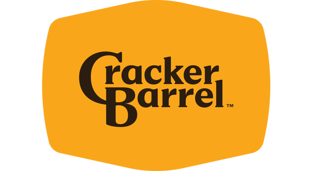
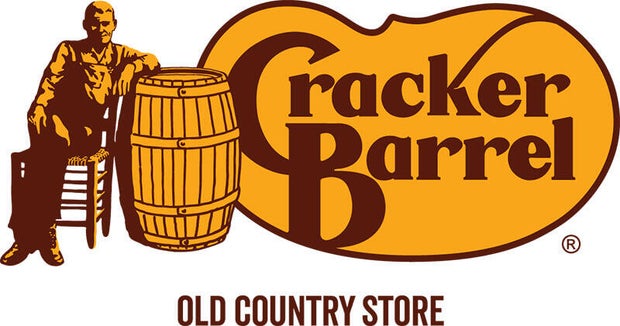
I think it's a little odd that a stock would plummet that much over a logo change. But it seems that is the issue. People think that it's too "woke". That is coming because of the elimination of the older gentleman sitting by the barrel. That logo has been in place since 1977.
THE OLD LOGO
How do you feel about the new logo? Do you think that it no longer represents what the Cracker Barrel tradition has always been?
They are also planning to revamp the menu a bit. Not sure what those changes will be at this point, but they said they don't want to change the downhome feel of the restaurant. So hopefully it's not too much of a change.

These Deliciously Retro Food Photos Will Make You Hungry for the '70s
Gallery Credit: Stephen Lenz
LOOK: These TV Guide Covers Will Take You Back to a Golden Age of Television
Gallery Credit: Stephen Lenz
More From 103.7 The Loon


